정준모


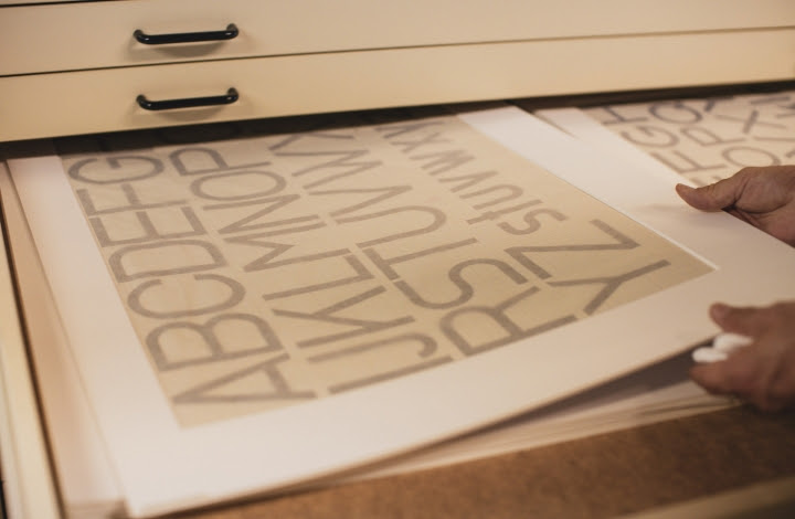
Tests of one of the Bauhaus Dessau typefaces
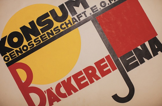
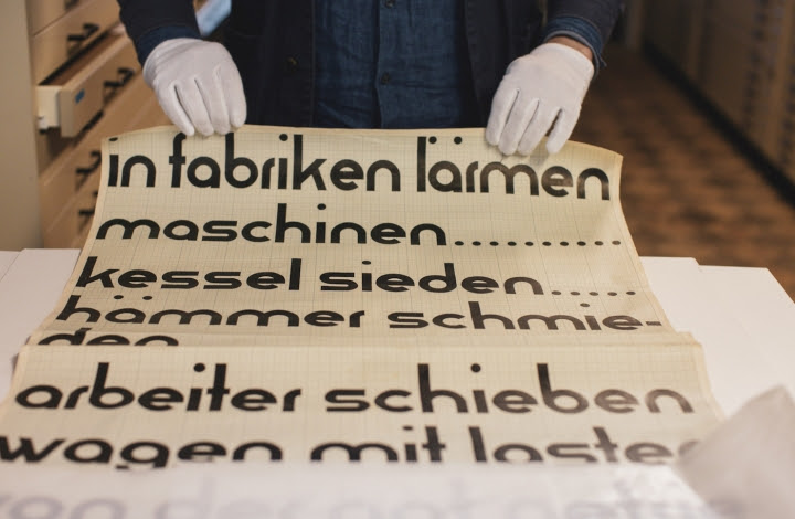
The process required digging into the Bauhaus archives, and for both Spiekermann and the design students, the experience was not unlike unearthing gems. The designs, which were all hand-rendered, had their own small flaws and quirks, the marks of works in progress or those left to time.
“It was a great pleasure,” Spiekermann said. “We ‘know’ most art simply from reproduction which usually neither indicate the real scale nor precisely show how the materials were used — like brushstrokes or other irregularities. The sketches were all much larger than we thought — I had seen some of them in the original before, but not all — the traces of the hand were more visible, and the colors were more vivid.”

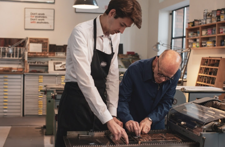
Erik Spiekermann working on the Bauhaus Dessau typefaces
Rendering the designs into digital fonts was an exercise in imaginative deviation; not all of them had been developed into full alphabets. “Some — most — of the Bauhaus exercises were about fitting the Roman alphabet into a geometric grid,” Spiekermann said. “We know that this method will not yield legible type, so we knew that we had to deviate quite a bit at times … . In other instances, we had to ignore some of the attempts to make legible letters rather than geometric shapes inspired by letterforms. The sketches were all quite naïve when it came to those issues.”
Luckily, the designers “know what it takes to turn a rough sketch into a working typeface,” Spiekermann added. “A type designer needs to be modest and not show off how good she is and what tricks she has up her sleeve. In this case, that meant we would have slowly and subtly guided the Bauhaus students toward designing type, had we been around then and had we had those tools available that we possess today.”

Test prints of one of the Bauhaus Dessau typeface
The resulting fonts are a delight to view and even better to put to use. In fact, you’ve seen a digital typeface born this way (almost) before. The Bauhaus 93 typeface is thick, bold, and available in the dropdown menu on Microsoft Word; it was used on the title screens for Super Mario Bros. (1 and 2!), in the copy for Disney’s Polynesian Village Resort, and, oddly enough, for the children’s film Postman Pat. Bauhaus design’s Modernist pedigree belies its wide accessibility; save for their appeals to children and the use of the typeface itself, the aforementioned cultural properties have little in common. Bauhaus 93 is a version of the Blippo typeface, which itself was designed by Joe Taylor as a darker version of Burko Bold — and Burko is based on another unfinished Bauhaus design.
Over the next several months, the remaining three “Adobe Hidden Treasures — Bauhaus Dessau” typefaces will be made available for download, and Adobe will launch five challenges for designers and artists to put these new tools to use.
The “Adobe Hidden Treasures — Bauhaus Dessau” typefaces are available via Adobe Typekit.
FAMILY SITE
copyright © 2012 KIM DALJIN ART RESEARCH AND CONSULTING. All Rights reserved
이 페이지는 서울아트가이드에서 제공됩니다. This page provided by Seoul Art Guide.
다음 브라우져 에서 최적화 되어있습니다. This page optimized for these browsers. over IE 8, Chrome, FireFox, Safari